Latin America - Promising Much, Delivering Little (?) to Long Term Investors
Today, I hope to start a series of regional market observations, exploring whether - in the big scheme of things - they offer investment opportunities for longer term investors, - and if so, provide some ideas of upside potential and likely strategies.
The First Topic:
Latin America, and - for the purpose of research - Brazil's BOVESPA, comparing it with mutual funds for Brazil and Latin America as a region. While in the main we limit ourselves to equity research, I also want to make comparisons with emerging market bonds/ Latin American bonds.
To make this a viable exercise for long term investor, we look back some three years, i.e. from August 2008 till now. This 3-year time frame coincidentally gives us plenty of clues on where we are - and where these regional markets are heading, viewed from a technical analysis perspective.
This chart has only one message, and it is an important one:
NASDAQ & BOVESPA CHART (above)
Going back to the peak in July/August 2007, we were used to paraphrased proverbs like: "if the US coughs, emerging markets get pneumonia. "
But all that came to an end just there.
Currency and Fund Performance
I often highlight the role currencies play in influencing the overall performance of mutual funds. Firstly, in Singapore, we have one of the strongest currencies in the world right now, managed in a way to always stay on the "crest of the wave", and almost always tilting to the rising currency of the time.
The funds we have for the Latin American continent are mostly USD denominated, or feeder funds into USD denominated funds, meaning that you pay SGD, but your money is then subsequently changed to USD, a process you can neither influence nor avoid.
 In this chart I am comparing two pairs of currencies:
Generally, we can see that over a 3-year period the REAL has strengthened against the USD, except during the period of the Great Crash. The REAL versus the Singapore dollar is less of a one way direction affair.: The REAL peaked in early 2008 and has since declined somewhat, excepting the period from October 2008 to March 2009.
FUNDS & INDICES
 This chart tells the main story today: we are viewing a 3-year period.
Starting from left to right in the chart we first note the final rise into May 2008 of the
First Observation:
During the crash, we record a loss of around -68% in MUTUAL FUND values, whereas the BOVESPA Index loses -56%. But then the decline of the REAL of some -31% adds to the figure for USD investors, creating a total loss in INDEX & CURRENCY combined of around -75%.
The difference between USD denominated mutual fund and combined index+REAL performance can be attributed to the ability of managers to add ALPHA, or simply an outperformance of the holdings versus the BOVESPA index. By contrast, Latin American funds also invest in Mexico, Argentina, Chile and other Latin American countries, though the weighting in Brazil is by far the largest.
Second Observation:
The BOVESPA at its peak records a level of 72593, in May 16, 2008! It then crashes massively (suffering about half of the total crash losses). The REAL does not decline in tandem with the index, and only succumbs months later when the US markets crumble in September 2008, leading all other global markets down, too.
Third Observation:
The rebound in the index is starting in October 2008, - but the REAL continues to weaken and Latin American funds do not get off their mark till March 2009, upon the implementation of QE1. The index retraces the entire losses only in October 2010, while funds completely recover by August 2010, and have since moved higher aided by a strengthening REAL. PLEASE NOTE: It is the interplay between the REAL and the USD that provides the uplift for USD investors.
The Alternative Option
 IGP does have a few extra options in terms of investment funds. Interestingly, here we can see the difference between a actively managed fund and an index fund. The Eurizon version clearly outperforms, indicating that Alpha is not easy to come buy especially when the management charge is 1% more than the index fund. Also the pure BRAZIL fund of BNP is underperforming the region. In short. we prefer to go with regional rather country funds in Latin America.
 Another alternative would be Emerging Market Bonds. We do not have a tool to invest in Latin American bonds alone, we therefore need to opt for Emerging Market bonds. Clearly, this is not a comparison of Apple with Apple. But that is not our purpose here anyway. We just want to point to alternatives offering returns without the higher risk associated with the region.
This chart offers a variety of investment styles from pure benchmark driven to actively managed and hedged to SGD. The one-year returns favour the risk conscious, SGD hedged solution.
OLD SNOW - WATER UNDER THE BRIDGE
I needed to tell you the above for none of the forecasts for future investments will make any sense unless we understand the factors influencing mutual fund performance figures and the - ALPHA that good fund managers are supposed to add.
The Immediate Future
 But, what exactly can we expect now from this market? To explore this we need to look at both the long term chart again, - and then the short term enlargement of the last few months.
The long-term chart (see right) tells us that generically, we are in a downward trend in Brazil since October last year. This is despite the fact that during the same period gold prices (again mainly in USD) have climbed ever higher, while commodities have seen several severe roller coasters. If we assume that commodities (and the export thereof) are still the main drivers, it comes as no surprise that bulls and bears are at loggerheads over the outcome - and all because China's economy shows signs of deceleration.
Chart Observations
The top in 2008 was the result also of strong resistance from earlier periods. Going through the crash trough October 2008 to March 2009 and retracing the downside, previous resistance is taken out in September 2010, and then becomes SUPPORT. This support has been tested 5(!) times (red dots, green/yellow-green) already. Interestingly, the tests came always a FEW WEEKS BEFORE a Fibonacci time line (see vertical lines in red), and also exactly on the time line also. Please take note that the next time line for now is in August.
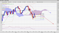
SHORT TERM MOVES - MEDIUM TERM TARGETS
 The short-term chart however tells us the potential for a totally different outcome from the bearish view now:
The Fibonacci Fan pointing down shows how firmly entrenched the down trend still is. I do not think that we can escape the fan until sometime after September. For the index to follow the arrows I drew and achieve the potential of 12% to previous peaks from mid 2010, the index first needs to break through the Ichimoku cloud, then the fan line above that and an influential Fibonacci retracment level - all in the next 6-8 weeks. The reprieve in September may then set the index up to finally break out of the last line of the Fibonacci line, out of this persistant downward trend and enter a new upward pointing trend. Time will tell.
More in the coming days.
The First Topic:
Latin America, and - for the purpose of research - Brazil's BOVESPA, comparing it with mutual funds for Brazil and Latin America as a region. While in the main we limit ourselves to equity research, I also want to make comparisons with emerging market bonds/ Latin American bonds.
To make this a viable exercise for long term investor, we look back some three years, i.e. from August 2008 till now. This 3-year time frame coincidentally gives us plenty of clues on where we are - and where these regional markets are heading, viewed from a technical analysis perspective.
 | ||
| BOVESPA & NASDAQ - There goes the proverbial correlation! |
Stock markets around the world are no longer 100% correlated.Many investors and commentators have been adamant that developed world stock markets and emerging markets are 100% correlated, - simply because the US market is so large and - up until now is viewed as having the lead role in stock market events.
NASDAQ & BOVESPA CHART (above)
Going back to the peak in July/August 2007, we were used to paraphrased proverbs like: "if the US coughs, emerging markets get pneumonia. "
But all that came to an end just there.
- Inconsistency (grey area, to October 2007)
US and European stocks moved largely sideways into October 2007, while Latin America, China and India went on to outperform the rest of the world.
- The CRASH (red area 1, to March 2009)
We remember undoubtedly that all markets crashed during that period! But globally, markets certainly did not perform in sync. October 2008 was the turning point for Latin America - and China, while other markets recorded their lowest point on March 9th, 2009. This divergence was probably the most prominent indication that markets are in the process of settling down and that an end to the downward pressure was in sight. But it took almost 6 months to finally finish gyrating.
- The REBOUND turned RECOVERY (in green)
March till August 2009 saw a giant turnabout, arguably the last significant period of more than six months with 100% correlated stock markets (large indices).
- QE2 drain emerging markets (red area 2)
Since the introduction of QE2, markets received divided attention. More moneys were now flowing toward the developed world and commodities. Especially Asia saw huge outflows, depressing the markets. But it was not a one-size-fits-all approach, nor was it conceivable on what parameters these largely institutional investors based their decision. We can say though with some misgiving that it was adherence to RULE No. 1, i.e. "as long as it is right for me in the short-term."Anyone telling you now how correlated markets still are, gently guide them to the figures! I could show the individual moves in relation to currencies but the picture would become ever more disconnected! and complicated to assess.
Currency and Fund Performance
I often highlight the role currencies play in influencing the overall performance of mutual funds. Firstly, in Singapore, we have one of the strongest currencies in the world right now, managed in a way to always stay on the "crest of the wave", and almost always tilting to the rising currency of the time.
The funds we have for the Latin American continent are mostly USD denominated, or feeder funds into USD denominated funds, meaning that you pay SGD, but your money is then subsequently changed to USD, a process you can neither influence nor avoid.

- Real and US dollar
- Real and Singapore dollar
Generally, we can see that over a 3-year period the REAL has strengthened against the USD, except during the period of the Great Crash. The REAL versus the Singapore dollar is less of a one way direction affair.: The REAL peaked in early 2008 and has since declined somewhat, excepting the period from October 2008 to March 2009.
FUNDS & INDICES

Starting from left to right in the chart we first note the final rise into May 2008 of the
- BOVESPA, and
- two funds we use here, also because they are the only USD funds with a 3-year history.
First Observation:
During the crash, we record a loss of around -68% in MUTUAL FUND values, whereas the BOVESPA Index loses -56%. But then the decline of the REAL of some -31% adds to the figure for USD investors, creating a total loss in INDEX & CURRENCY combined of around -75%.
The difference between USD denominated mutual fund and combined index+REAL performance can be attributed to the ability of managers to add ALPHA, or simply an outperformance of the holdings versus the BOVESPA index. By contrast, Latin American funds also invest in Mexico, Argentina, Chile and other Latin American countries, though the weighting in Brazil is by far the largest.
Second Observation:
The BOVESPA at its peak records a level of 72593, in May 16, 2008! It then crashes massively (suffering about half of the total crash losses). The REAL does not decline in tandem with the index, and only succumbs months later when the US markets crumble in September 2008, leading all other global markets down, too.
Third Observation:
The rebound in the index is starting in October 2008, - but the REAL continues to weaken and Latin American funds do not get off their mark till March 2009, upon the implementation of QE1. The index retraces the entire losses only in October 2010, while funds completely recover by August 2010, and have since moved higher aided by a strengthening REAL. PLEASE NOTE: It is the interplay between the REAL and the USD that provides the uplift for USD investors.
The Alternative Option


This chart offers a variety of investment styles from pure benchmark driven to actively managed and hedged to SGD. The one-year returns favour the risk conscious, SGD hedged solution.
OLD SNOW - WATER UNDER THE BRIDGE
I needed to tell you the above for none of the forecasts for future investments will make any sense unless we understand the factors influencing mutual fund performance figures and the - ALPHA that good fund managers are supposed to add.
The Immediate Future
 But, what exactly can we expect now from this market? To explore this we need to look at both the long term chart again, - and then the short term enlargement of the last few months.
 The long-term chart (see right) tells us that generically, we are in a downward trend in Brazil since October last year. This is despite the fact that during the same period gold prices (again mainly in USD) have climbed ever higher, while commodities have seen several severe roller coasters. If we assume that commodities (and the export thereof) are still the main drivers, it comes as no surprise that bulls and bears are at loggerheads over the outcome - and all because China's economy shows signs of deceleration.
Chart Observations
The top in 2008 was the result also of strong resistance from earlier periods. Going through the crash trough October 2008 to March 2009 and retracing the downside, previous resistance is taken out in September 2010, and then becomes SUPPORT. This support has been tested 5(!) times (red dots, green/yellow-green) already. Interestingly, the tests came always a FEW WEEKS BEFORE a Fibonacci time line (see vertical lines in red), and also exactly on the time line also. Please take note that the next time line for now is in August.
SHORT TERM MOVES - MEDIUM TERM TARGETS

The Fibonacci Fan pointing down shows how firmly entrenched the down trend still is. I do not think that we can escape the fan until sometime after September. For the index to follow the arrows I drew and achieve the potential of 12% to previous peaks from mid 2010, the index first needs to break through the Ichimoku cloud, then the fan line above that and an influential Fibonacci retracment level - all in the next 6-8 weeks. The reprieve in September may then set the index up to finally break out of the last line of the Fibonacci line, out of this persistant downward trend and enter a new upward pointing trend. Time will tell.
More in the coming days.


Comments