Financial Markets Out Of Sync Part II
In continuing our short-term assessment of financial markets, today's report covers European indices. If you want to check back on US and Canadian indices in Part I, click here.
Last Sunday, I concluded that a new leg down in equities has started. It should reach a first significant low point around April 18, +/- 3 days. The sell-off could be strongest in large and mega cap stocks. Can this be confirmed by the cycle research in European indices?
Last Sunday, I concluded that a new leg down in equities has started. It should reach a first significant low point around April 18, +/- 3 days. The sell-off could be strongest in large and mega cap stocks. Can this be confirmed by the cycle research in European indices?
Part II - European Equities
1. EuroStoxx 50
 |
| EUROSTOXX50, a 1-year view: a 1 year correction that has more downside to come. DATA SOURCE: chartnexus |
In this chart I want show you how the price moves formed, where we are at now, and the outlook for the next few weeks. The peak in April 2015 is very prominent. Visually, it is also the starting point of the downturn. Focussing on the left half of the chart, please observe how this gradual decline morphs into a WEDGE. It is hemmed in by a rising, blue diagonal line, an extension of the lowest level of a Fibonacci fan, which I drew from the beginning of the last EuroStoxx rally in 2011 (!). It has served as support throughout since then, i.e. prices did not go below it. Making up the border on the top, I drew a multi-coloured line from the April high, sloping downward,and connecting with the next lower peak. It eventually meets the support line in the middle of the chart, and signifies a very crucial moment for the price movement.
- Two thirds into the wedge, prices touch support (yellow circle) and bounce off to form an 'M' along the multicoloured trendline, which acts as resistance.
- From this point forward, the wedge acts like a pressure cooker under the increasing heat. Price volatility and volumes increase. The next move down breaches the blue support line (see red circle), thus officially ending the Fibonacci fan pattern, which put structure to the 5 year rally.
- Markets almost immediately set out to correct the breach. Despite strong buying interest, prices only manage an interim high, stopped by the blue support line (NOW RESISTANCE). A second attempt to get back into the upward trend is thwarted where the multi-coloured trendline (light green arrow) meets the blue support line.
- This is the point in the chart where we enter real bear market territory (right half of chart): Note the first 5-wave move down, impulsive and devastating. it is followed by a rebound, retracing 38% of the previous move.
- Now, the next 5-wave move down should develop. I drew 3 arrows, the 2 smaller ones offering guidance for the likely positions by April 18 +/- 3 days, while the larger one carries on to the end of May.
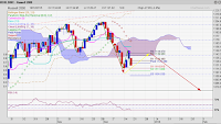
2. German DAX
 |
| DAX, 6-month chart, Elliot wave bear moves to June 2016 DATA SOURCE: Chartnexus |
In this chart of the DAX, I am zooming into the chart, only analysing the moves since October last year. Back then, I correctly predicted the first 3 waves. From the peak, two YELLOW arrows connect to point 1 and 2, the RED arrow leads to point 3. The index hardly swerved from that outline.
Prices went on to form a 4th and 5th wave, the end point, marked by the lower yellow circle. A 5-wave structure in Elliot wave terms means, this move is in trend, i.e this 5-wave move represents a resumption of the bear market trend.
The subsequent upward movement is messy, as is the process of forming a top. Corrections against the trend often are. Every few days the direction changes. I had calculated March 18 as a turning point, and all my orders to sell were executed the day before or on the day itself. The key to preparing an exit is to cut loose when the momentum grinds to a halt, often indicated by a Japanese hammer candle. It did, on March 14.
The DAX held on to those valuations for another 8 trading days, but as of Tuesday. April 5, the time of dithering is over: the index closed the day down -2.6%. This is a clear indication that the rebound (correction in a bear market) is complete. If I am correct, then we won't return to these levels for quite a few months.
The coming downward move is outlined with the fat arrows, red, then green and red again. This is the likely path, the index will take till early June. The first red arrow points to the third week of April as the ending of wave 1. This would tie in with the time line for the leg down in the US indices.
The targets:
The figures assume a relatively mild start to wave 1. Actual sentiments may drive markets much lower. Indeed, if today is the start to another 5-wave move down then I will probably need to revise the angle and length of the second red arrow (wave 3). I will tell you more about the anticipated wave 4 & 5 later this month or early May.
Wave 1 down, -9% [9172],
wave 2, retracing about 4% to [9525]
wave 3 down, -14.5% [8145], subject to revision.
3. Other European Indices
Most of the other indices are in much the same shape as the DAX and the EUROSTOXX, for which you have had lengthy explanations. The extra charts show this quite clearly. So, few words enough.
a) FTSE 100
 |
| FTSE 100 UK equities, 1-year view, with outlook to end of April 2016 DATA SOURCE: chartnexus |
The "WEDGE" here is not as obvious in structure as in the EUROSTOXX 50 chart, but it still produces similar selling pressure. Additionally, I indicate a Fibonacci Time Line, for April 29 (vertical line in black). Please note, time lines in a number of European indices suggest that the next low point will be reached more likely AFTER April 18, than before!
b) CAC40
 |
| FRENCH EQUITY, CAC4, 2 year view. Decidedly more spirited when it comes to overshooting targets. DATA SOURCE: chartnexus |
The French index is littered with yellow circles! They show the times when prices overshot trend lines - and still got back into the trend. It's a sign of nervousness as well as overconfidence among French investors. The two-year view, allows me to also show you the second Fibonacci fan level above the index (also in light blue). It is superb how the index fills the space in between , and hits it highest point when and where it should. The WEDGE is larger and the 5-wave move starts inside the wedge, which, to me, is a little suspicious. Time will tell. The next time line shows up in early June, hinting at an extended period of consolidation.
Click here for
Click here for


Comments