Financial Markets Out Of Sync Part I
click here for
Financial Markets Out Of Sync Part II
In my last post, I reintroduced my model. How else can I prove that my work carries benefits? Soon, I will elaborate on the model attribution, its strategy, and the reasoning behind the tactical changes over time.
Today, it's all about WHERE WE ARE RIGHT NOW with the markets. Last week, I said, global equities are getting out of sync. Now we can show how disjointed the markets have become. The information may help the experienced investor, though everyone wants direction and targets for future market moves. I will do so in this report, valid for the coming weeks, covering equities, commodities and currencies, each asset class in a separate blog post. It's an extra chance to adjust your positions accordingly, if you think my mumblings make sense.
Part 1 EQUITIES - USA and Canada
equities
I will show charts of Northern American, European, and Asian indices. You will note the divergence, and the red fat arrows I drew signifying the likely path for the next 3 weeks. If my research is correct, then markets will converge again in about 3 weeks, meaning that - except for a VERY FEW, - most equity indices will TURN DOWN now as the correlation increases. The bear market sentiment prevails for the time being. Markets, which have been trending up, will return to a corrective pattern till
April 18th, +/- 3 daysat least. While correlation between markets may increase, the relationships between equities, bonds, currencies and commodities, however, will continue to look anything but traditionally aligned.
US equity
1. S&P 500 as of April 2, 2016
 |
| S&P500, since November highs to now Data Source: chartnexus |
Volumes often highlight an upcoming change. Like they did in December 2015 (big green oval):The last big volume day occurred on a down day, (i.e. more people sold on the LAST DAY of the correction), followed by timid volumes during the bounce that followed ("I don't buy into this").
The period leading up to the rally peak on March 22 has one huge volume day (small green circle), 4 trading days before the peak. Again we can see how gullible a large majority of people are, buying late into a market trend. From the March 22nd peak,markets attempt to go higher still (see blue line connecting the secondary and final high), but this move is NOT supported by the RSI (see lower red line connecting the secondary and final high in the RSI). It is a clear divergence and a signal that we must expect a trend change now.
The Next Downside
The targets for the coming leg down are marked by two fat arrows in red / dark red. They are calculated using the Fibonacci 61.8% retracement of the previous rally (1927 [-7%]/1883 [-9%])and time zones [April 17/18]. The chances for the index to reach the lower target is 70/30, and 50/50 for the higher target.
Indeed, don't be surprised if downside targets are exceeded. Downside targets under bear market conditions are more readily breached than rally targets in a bull market. It means to say: People press panic buttons faster than the take-profit button during a rally.
Indeed, don't be surprised if downside targets are exceeded. Downside targets under bear market conditions are more readily breached than rally targets in a bull market. It means to say: People press panic buttons faster than the take-profit button during a rally.
 |
| DJIA, since November highs to now Data Source: chartnexus |
The technical picture is very similar to the S&P 500 above. There is one notable difference: Friday's new top for the year hits a Fibonacci retracement level for the third time since December 15, 2015. This level has become quite a formidable resistance level.
a) Volumes show similar pattern.
b) same divergence between secondary top in index and lower high in RSI on Friday.
c) The targets for the correction are : (16482 [-7.4%] / 15640 [-12%], the latter finding support at the low from February 16, and January 18.
The divergence in the lower targets of S&P 500 and the DJIA is warning us not to underestimate the selling pressure during this period!
 |
| RUSSELL 2000, since June 2015 high point to now Data Source: chartnexus |
This index is following a decidedly more bearish path. Its consolidation started end of June 2015. Since then, it has given up a whopping -26% to a final low (so far) on February 15. The outline of the consolidation forms a Fibonacci fan, the upper outline of which I highlighted in blue-red, the lower in pale pink. For the crucial sell-off in January to February this year (see big green oval), I underestimated the virility of the momentum: my original red arrow points to a significantly higher level of maximum downside compared to the actually low point achieved by mid-February.
a) I ignore the volumes data for this chart.
b) a longer lasting divergence between secondary top in index and lower high in RSI on Friday result in the rally fizzling out as early as March 8, while the RSI falls more steeply.
c) the downside targets are less clear-cut: Till February 18 +/- 3 days, I expect a target (985 [-12%]), finding support near the second falling fan line, having hit the first one at 1118 on Friday. However, it is quite likely that the bear phase will extend into May to about 930, creating losses of -16.8%. Small caps have been highlighted as the likely losers in my mid-year outlook of June 2015, though the actual losses exceeded my expectations.
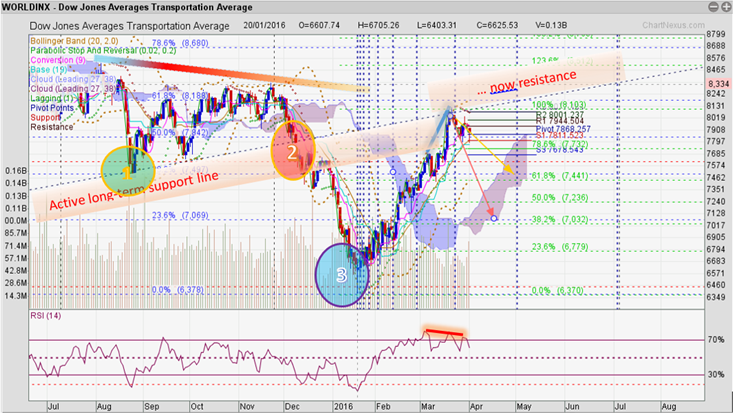
4. DJ Transport Averages
 |
| DJTA, since November 2015 highs to now Data Source: chartnexus |
= a leading indicator according to some experts.
This index has been correcting even longer, since END OF NOVEMBER 2014! If indeed, this is supposed to be a leading indicator, then right now, the first index to 'fall in line' with the change in trend are the small caps (3. RUSSELL 2000), see above.
I drew the blue-red trend line between the last significant index high in March 2015 and the lower high on November 20, and beneath it, a long-term, upward trending support line. The two lines cross in mid-March. This pink support line is well respected: even the impulsive drop between August 19-26 last year resulted in only a minor breach followed by a strong bounce, which drastically slowed the momentum of the ongoing correction. However, the subsequent downward move was an impulsive, well structured A-B-C move, breaching long-held support levels.
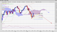
Let's look at what happened then in a close-up chart.
 |
| DJTA, since June 2015 highs to now Data Source: chartnexus |
The ovals 1,2 & 3 show the most significant turning points in recent months. As mentioned above, point 1 marks the end of the slower part of the downward move. Point 2 marks the impulsive breach of the long-held support, and point 3 a likely end to the 16-month consolidation! If this is correct, the rally from January 19 to March 18 could be a first leg up in a major trend change. This rally displays a 5-wave structure (Elliot wave), which should now be followed by a 3 wave corrective pattern, keeping well above the January low if our working assumptions are correct.
a) Volumes well support this new trend change.
b) a divergence between secondary top in index and lower high in RSI on Friday, similar to the other indices I showed above, but not as contrasting as in the RUSSELL 2000.
c) the downside targets seem less daunting: a worst case scenario projects a downside to 7033 [-13%], or the more benign scenario of 7482 [-6.7%] . The latter would be a strong indication that a real trend change is forming. This would be quite a typical behaviour pattern for this leading indicator to come out first in a major change in direction.
Canadian Equity Index
S&P / TSX 60:
 |
| S&P / TSX 60, since April 2015 highs to now Data Source: chartnexus |
I showed previously that this index is more aligned with oil prices and the US small caps. Canadian shares have been correcting since mid-April last year, devaluing by -25%. This figure compares to the RUSSELL 2000's -26%, but also in terms of the consolidation period. It further correlates to the DJTA correction, where I suggested that it may be on the verge of a trend change. Please observe the yellow circle in the chart above,which shows a clear break out of the Fibonacci fan structure, which is a first sign that the correction may form the first stage in an upward move that could last a few months.
This next chart close-up may shed more light:
This next chart close-up may shed more light:

- Wave 1 exceeds the previous double top highs,
- consolidates in a short wave 2,
- followed by wave 3 of ideal character, getting stopped only by the first level Fibonacci fan line.
- The index then pulls back a few days (wave 4)
- before turning up into wave 5, and breaching the said fan line, (see yellow oval) which had been impregnable until now, to reach a new-year high.
The correction, which is underway, should be relatively minor with losses of (-6%) if it ends at the horizontal blue line that I drew from the earlier twin-top high. Timewise, April 18 looks a suitable end date, though it could drag on into May, too, since many other markets are languishing during that period.
Summary
Major indices in the US are turning down now. Large and mid cap stocks are particularly vulnerable at this stage, while small caps, having corrected for a longer period of time, may see limited selling pressure, though pressure nonetheless. Canada's shares have already corrected substantially, and I expect those shares to largely hold their values, or possibly even buck the trend.
That's it for today. European and Asian equity forecast will follow very soon, and in yet another post, the likely "fate" of gold, oil and currencies.
click here for
click here for


Comments