OCTOBER TURNS, PART 3, the US Dollar
USD PEAKS
It is time to take a critical look at USD charts in light of noises about a December interest rate hike, AND because I got it so wrong in my prognosis in September, when I said the dollar should start to soften, and allow gold prices to slowly get into rallying mode. We saw quite the opposite and the portfolios suffered as a result.
Looking Back - A Quick History
Some time in August 2001, the USD stood at an alltime high of 121. The dot.com bubble had burst and its correction was in full swing. For investors,the USD stood for surety and a safe haven to shore up against a stock market that was falling apart. Everyone rushed to buy the dollar!
Interest Rates and The USD
 |
| SOURCE: FRED ECONOMIC DATA; US interest rates from 2001 till today. |
But the crisis quickly engulfed all global economies. From a peak of 6.25%, the Federal Reserve had to reduce interest rates to 1.25% over 12 months and a bit lower still in 2003.
When the global economies eventually recovered, higher interest rates were applied in due course to stop economies overheating.
Fast forward to 2007, economic commentators were revelling in the prospects of an unstoppable stock market rally and ever rising GDPs. Considering that in 1981, interest rates had risen to 16%, the rise of between 2003 and 2007 to 6.25% could be deemed as timid, certainly not stopping the housing market from going into overdrive. Then again, interest rates hikes do not prevent fraud, mismanagement or greed...
And so the crisis hit! Between July 2007 and January 2009, interest rates fell to just 0.5%, but it wasn't enough to prevent the scariest recession of this century so far. In the chart recessions are indicated by a vertical blue shade.
Fighting To Stay In The Race
Reducing the interest rates was one part of the measures, the FED undertook under Chairman Alan Greenspan and later Ben Bernanke, to counter the severe economic downturn. It was the intro to what later,became known as Quantitative Easing (QE) in response to - what the media dubbed - the Great Financial Crisis or GFC. The impact on the USD was one of severe buying power collapse.
 |
| Source: barchart.com, USD 25 year view, monthly data, with Fibonacci retracement lines hand-drawn by the author. Don't look for pinpoint accuracy. |
A Little More Data History
In the following chart we look back over 25 years, using monthly data of the USD.
July 1981 was the all-time high of the USD, when interest rates, too, were at a major peak. The correlation between interest rates and the USD is ongoing, though obviously the moves in the currency far outpace those of the rate change. At the very right of the chart, we see the USD trading range-bound for the past few months. Such a behaviour is typical at this level: prices are close to the halfway mark between the peak in July 1981 and the trough in March 2009. Going by Fibonacci rules, the 50% mark is often a time of indecision in the markets. It could mean that the USD now a) stalls, b) stays in range or - b) takes off on another rally. This chart therefore offers little to help with our short-term trading decisions. To find out where the dollar will move next, we need to look at a shorter time frame, using weekly or daily data.
The next USD chart covers the period between 2005 and today. The Fibonacci retracements, fans and time zones are now based on the period in view.
 |
| SOURCE: chartnexus; details and add-ins by the author. the USD from 2005, through GFC and after first rate hike. |
At that point, the conscientious investor would have noted the divergence and - sold out of the USD. Rightly so, as by the time the GFC got into full swing, the USD was already down 11%. The FED's response, rapid reductions in interest rates, drove the USD down another 13%.
The GFC hit its final low point in March 9, 2009. From this point onwards, the USD rallied sharply, retracing 31.8% of the entire losses since 2002, which coincides with the 81.3% retracement in relation to the 2005 peak. I point out these relationships to show the reader that price movements have a clearly identifiable structure, allowing the analyst to simulate future moves with a degree of certainty of the outcome.
During QE measures, (middle orange square) the dollar fell drastically, initially in response to the interest rate cuts, which were supposed to curtail the fallout of the bursting housing bubble in 2006/7. But it quickly became a race to the bottom, in the attempt to save the US economy no matter what. As soon as the end to QE was announced in 2013, the dollar started rising again. The real trend change came in July 2014 when the FED provided unequivocal guidance on how the QE would end and the "normalisation" of interest rate policies would begin (right square). The rate increase in December 2015 only added some extra momentum in the short term to the peak in March 2016.
Today, the USD is at a crossroads. If in December, the FED goes ahead with the second rate increase, the USD will probably rally further. If past reactions by punters are indicative of a typical response, however, then December, and January could become a dismal period for equity investors. At least, more and more analysts seem to think so. Then again, I am not entirely clear that this will happen, because cyclically, too many factors are yet to come into focus, each one with the potential to change the outcome. The presidential campaigns are but a sign of the underlying forces at play, not the cause! At the risk of drawing ire, I repeat, "we are living in extraordinary times." I find it quite incredulous, how anyone could assume the post of the know-it-all under such circumstances.
 |
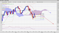
| Source:chartnexus, details and add-ins the author; USD since late 2015 till now. HITTING THE HIGH 3 TIMES? |
WARNING!
With the last chart I hope to outline the probabilities, as I see it. That is the best I can do right now. In the near future, I hope to narrow down the options so as to give us an opportunity to act on it - and invest with a clear risk reward concept.
With the last chart I hope to outline the probabilities, as I see it. That is the best I can do right now. In the near future, I hope to narrow down the options so as to give us an opportunity to act on it - and invest with a clear risk reward concept.
Looking at the chart, you might turn away bemused. Info-overload, I am sorry.
The rise from December 2015 looks very steep, breaking through the rising fan sections (highlighted with glowing diagonal lines) with plenty of momentum. It finally stops where it should, a Fibonacci resistance from the past (RED ARROWS).
THIS PARTICULAR FAN WAS DRAWN FROM THE LOW POINT OF THE GFC IN 2009. AND IT IS OBVIOUS THAT ITS ENERGIES ARE STILL LIVE AND CHART FORMING. The yellow (third fan spoke) and red (second spoke) glowing circles along the fan lines are highlighting, where prices respect and respond to the Fibonacci fan, either as resistance or as support. Since the first RED arrow to the third, i.e. up until now, prices trade very much in range, although the range is accompanied by unusually high volatility.
As of last Friday, prices trade below the second last Fibonacci fan level again (orange glow), but it is entirely conceivable that they can regain a position above this fan level! If the markets like the new president and the FED raises interest rates in December, such an outcome might even result in breaking through the existing resistance levels and reach for levels beyond 100.
All this action of aiming higher is happening while the RSI is diverging (see thin light brown arrow bottom chart)! That leaves a big questions mark regarding the present consensus opinion about more dollar strength. The most frustrating price action would be to go sideways, at reduced volatility levels. But it could also act as a signal that the USD will very soon correct, in relation to the rise from last December till March.
To be specific: the most obvious correction targets would be to 91.9 level (61.8% Fibonacci), but it could also take us down to the 38.2% Fibonacci retracement, which would be the 87.76 level.
To be specific: the most obvious correction targets would be to 91.9 level (61.8% Fibonacci), but it could also take us down to the 38.2% Fibonacci retracement, which would be the 87.76 level.
USD Short-Term Probabilities
The wild array of arrows criss crossing at the end of the data line are supposed to tell you whereto next for the US dollar. Normally, the direction would really be obvious, i.e. either up or down, or sideways. This time I can't really take the arrows very serious, despite the detailed research I made in defining them. The signs at present do not give us a clear direction let alone the size of the next move, short term.
- the price structure fits nicely into the uptrending fan, That means, we are dealing with a known quantity with well defined properties. The overall move since early this year has been sideways. The moves are nicely emphasised by each of the fan spokes, and prices are now nearing the last/lowest spoke.
- A break here at a level of 94.50 by latest December would mean the sideway direction is finished and the next move is down.
- If prices move beyond 100.7 anytime soon then the dollar will more likely continue upwards. and possibly with quite some verve.
- Meanwhile, politics and cash flows into the dollar tend to support ongoing strength.
It is almost like, you chose the scenario you like best.
Very short-term, i.e. the next 2 weeks, I think the dollar will continue sideways in the erratic fashion we have come to get used to this year.
If this outlook does satisfy you then consider a longer term view: I still believe that at some point in this decade the dollar will suffer a further buying power collapse, potentially more disastrous than in 2009. Any advance now, I view somewhat suspiciously. That does not mean that in cannot be traded short term, of course.


Comments